Designer Secrets: 14 Chic Ways to Trim Your Decorating Budget
The Victorian house in the heart of San Francisco’s sunny Noe Valley neighborhood had been well-loved over the past 100 years—but it had also suffered from an ill-conceived remodeling project or two. So when the new owners of the duplex’s upstairs flat began planning a redesign of their own, their strict budget had to allow for fixing past mistakes and creating a forward-thinking family-friendly design.
The couple enlisted Katie Martinez, a young San Francisco-based designer known for bright, effortlessly elegant interiors. To meet their budget without compromising on style, Martinez created a few ground rules: Stick to a simple palette of classic finishes, make efficient use of labor and materials, choose affordable fixtures and furnishings when possible, splurge where it really counts, and have patience. “The clients understood that there were significant savings to be had by not rushing the project,” Martinez says.
They began the seven-month construction process by stripping the rooms of their dated wood veneers, dark granite counters, cheap lighting and appliances, multicolored glass backsplash tile, and vinyl flooring. “It’s often easier to get rid of things and start over than to preserve little parts here and there,” Martinez explains, “so in some places we went down to the studs.”
The clients understood that there were significant savings to be had by not rushing the project."
–Katie Martinez
The two-story flat’s top floor had been divided into tiny bedrooms, so they removed the interior walls and a dropped ceiling to create a large family room, then added a broad west-facing window to bring in natural light and views toward Twin Peaks and Sutro Tower. On the main level, they reconfigured the master bedroom, which had only allowed for the bed to be pushed into a corner, and opened up the staircase to help connect the kitchen and dining areas with the family room above.
To emphasize the new floorplan’s free-flowing vibe while bringing back some of the home’s original character, Martinez composed a restrained palette of Carrara marble counters, white cabinetry, unlacquered brass hardware, porcelain doorknobs and solid walnut finishes. Bright white walls provide a backdrop for the homeowners’ collection of textiles, rugs, and artwork—and she also incorporated a few bursts of bold color and pattern, from the master bedroom’s deep blue wall to the bathroom’s graphic concrete floor tiles.
The reimagined rooms reflect Martinez’s bright and breezy signature style—but more importantly, the original character of the Victorian house and the personalities of its new owners. How did Martinez achieve such a dramatic transformation without breaking the bank? Here, she shares her secrets to this budget-conscious design—and how they can work for you:
There’s no need for lots of bells and whistles when you allow small, special details to shine. Here, Martinez created a “simple white kitchen” with Shaker-style cabinets, slabs of Carrara marble and a wall clad with subway tile from Heath Ceramics. Against that pristine backdrop, unlacquered brass cabinet pulls from Rejuvenation and an unlacquered brass faucet from Waterworks can make a bold statement.
Instead of lining your kitchen’s walls with closed upper cabinets, incorporate some open shelving, which makes a small space feel larger and is typically a less expensive choice. Here, Martinez mounted simple walnut boards atop shelf brackets from Liz's Antique Hardware. “We used brackets rather than concealed steel supports because they felt more old-fashioned and added character,” she explains. Exposed dishes and glassware take the place of art and accessories, adding functional beauty and texture to the space.

If you love the look of veined white marble but don’t want to blow your budget on one slab, opt for Carrara rather than rare Calacatta, as Martinez did. “I chose it because I really love the look and simplicity,” the designer explains, “but it is less expensive than Calacatta,” which is considered a luxury stone.
“When each piece is beautiful and impactful, you need less,” Martinez says of the eclectic dining set she created by pairing a custom oak table with vintage Paul McCobb arm-and side-chairs in classic black. (“I typically don’t match furniture finishes,” she notes.) A rug purchased via Etsy and the midcentury-style Atomium chandelier from Lambert et Fils add a pop of color and personality to the room.
For a nursery, choose simple furnishings you won’t mind parting with in a few years to create a clean backdrop for the personal artwork, objects and textiles you’ll keep for a lifetime. Here, streamlined furniture and walls painted Farrow & Ball’s soothing Borrowed Light hue allow the eye to drift up to the ceiling, where a local artist hand-painted a view of the night sky at the exact time of the little boy’s birth.
Martinez trimmed her clients’ furnishings budget by having a craftsman make a built-in headboard wall and matching side tables, but not the bed base. For that, she simply pushed an inexpensive base from CB2 against the wall. To cut material and labor costs, she had the bedroom furnishings, office desk, and kitchen shelves all made at once from the same lot of wood, and requested walnut with visible knots and lighter sapwood portions. “It’s more cost effective than pristine boards and I love the character,” she explains.
“Don’t underestimate the power of a personal collection,” Martinez advises. “My clients’ little textile at the foot of the bed makes a huge impact—in fact, I think it makes the room.” Beneath it, a hand-embroidered Mexican Otomi coverlet from L'Aviva Home emphasizes the bedroom’s soothing blue mood.
There’s no need to spend on paintings and sculpture when your furnishings and accessories pack a punch. This bedroom’s dramatic built-in walnut headboard, walls painted Farrow & Ball’s bold Hague Blue, and brass Isaac sconces by Schoolhouse Electric “provide so much color, texture and visual interest that you don’t need to hang a thing on the wall,” Martinez says.
Traditional desks can be bulky and pricey. Martinez saved money—and precious square footage in the small home office—by having a furniture-maker build a “desk” that’s really just a smooth walnut board supported by both side walls. The design may be “super simple,” but it provides a large workspace that easily accommodates the couple on days when they both work from home. A wall clad with inexpensive cork provides a look Martinez loves—plus plenty of pin-up space. The slim and simple Flynn Table Lamp by Serena & Lily (right) offers stylish task lighting.
What’s the secret to maximizing seating without spending a fortune? “A very soft rug!” Martinez says. “Everyone is always lounging on the carpet.” What style and size is best? “I love larger antique rugs if you can afford them,” she says. “If not, I suggest keeping it simple with a rug like this one below (from Restoration Hardware) and adding a small antique throw rug or pillows on top, or foregoing a big rug altogether and using small throw rugs.”
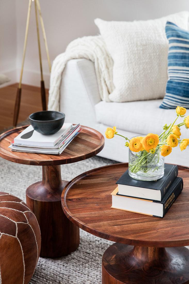
Smaller, portable furnishings typically cost less than heftier ones, and they’re often more useful around the house too. Rather than pairing the family room’s slipcovered Eilersen sofa with one large coffee table, Martinez chose a pouf from Serena & Lily and a duo of acacia wood side tables from Blu Dot. “They can easily be pushed aside to create seating or play space on the floor,” she explains.
They say the most successful diets allow room for a splurge here and there, and the same principle applies to cost-conscious design. “I think the splurges are what make a project,” Martinez says, “so make sure to preserve a few places in your budget for them.” One of this family’s favorite big purchases is an Eames Lounge Chair from Design Within Reach. “It’s beautiful and well-designed, as well as very comfortable,” Martinez says.
Keeping windows bare eliminates pricey blinds and draperies from the budget with another added benefit: The simple, unfussy look helps create a continuous, light-filled space—and preserves the view.
It’s easy to spend a fortune on tile but certainly not necessary. Martinez discovered handmade encaustic cement tiles from Cement Tile Shop that make a major statement at a cost of $6.90 per piece. A new cast-iron-and-porcelain clawfoot tub from Rejuvenation looks like an antique, but offers the modern-day improvement of a deck-mounted faucet, while a streamlined vanity from Rejuvenation saves precious space.


