One Bad Kitchen, Three Good Designs
Synopsis: In this case study, three designers/architects are assigned a set of fictional clients who have differing requests for a remodel of the same problem kitchen. Ashlee Richardson redesigns the space for empty nesters aging in place, Elizabeth Morgan is tasked with an eco-minded remodel, and Garrett Kuhlman, an avid cook himself, is given clients who love to cook and want to modernize the space. Each theoretical remodel includes extensive 3D floor plans along with a description of spec’d products and materials, displaying the many options for remaking the same space to suit different needs.
Remodeling a kitchen is always a big undertaking, but some kitchens are harder to fix than others. The size, the shape, and the way the space connects to the rest of the house can make it hard to add functionality, never mind bring it up to date.
Many homes built in the boom following World War II are tricky to remodel without adding on to them. They tend to be small, with closed floor plans that wall off rooms according to function, leaving their kitchens—which are typically designed for just one person—shut off from living and entertaining areas. That’s exactly what most people don’t want in a modern floor plan. Because these midcentury kitchens are so common and so gnarly to modernize, we wanted to see how a handful of architecture firms would tackle the task
Each designer had the same kitchen to work with—the one in my mid-1950s ranch—but received different instructions about their clients’ tastes. We tried to keep the budget on the low end, realizing that putting a price tag on such a project is not particularly useful information when the costs of materials and labor vary widely across the country. What we hoped to see—and what these firms delivered—are some smart lessons and ideas for anyone trying to bring function and beauty to chaotic, disconnected kitchen.
Boxed in
Putting a sink in a corner can result in longer stretches of clear counter, but it also turns the dishwasher into a death trap and guarantees you won’t get help with the dishes.
The location of the doorway from the kitchen to the living room renders an entire wall unusable and creates a large dead zone.
With a protruding fridge, a shortage of cabinets, and clutter aplenty, there’s little room to work or for extra hands to pitch in.
Those working in the kitchen can’t see or hear what’s going on in the rest of the house, and there’s scant room for anyone to join them without getting underfoot
Priorities:
Architect: Ashlee Richardson
Nar Design Group in East Sacramento, California, sees a lot of empty nesters come through the door—in fact, they make up the core of the firm’s clientele. So it makes sense that that’s who we had Nar’s team design for.
The neighborhood of East Sacramento includes a large number of World War II–era homes—mostly small bungalows with closed floor plans. “When we’re designing these spaces, we’re always trying to open them up as much as possible and make the kitchen communicate with those spaces,” says Ashlee Richardson, Nar Design Group’s lead designer and project manager
Moving walls is expensive, but it’s possible to add openness without breaking the bank. Nar’s plan started with widening the door between the kitchen and living/dining room area. “We’re not getting into major structural changes,” Richardson says. “We’re just widening the header and having the spaces communicate a little bit more.”
It’s a relatively modest move, yet it creates new sightlines between the kitchen and dining area, and allows the dead space of the bare wall to house cabinets. A shallow bank of lower cabinets on the other side of the opening, with floating shelves above that wrap around the wall from the kitchen into the dining area, create additional storage and a purposeful link between the spaces. “You don’t feel like you’re either in the kitchen or the dining room or the entry,” Richardson says. “It all flows as one space.”
To make room for more than one cook, the cabinets and most of the major elements are reorganized to create three separate work zones. For the first, Nar’s team moved the sink out of the corner and took a chunk out of the “U” to create a corner nook for the dishwasher, where it can open out of the way. Because the extra-deep expanse of countertop at inside corners can often be wasted space, this also makes the counter above the dishwasher more useful.
For the second station, the range was replaced with a rangetop flanked by and sitting atop cabinet drawers, and backed by an easy-to-clean quartz backsplash. A pair of ovens—one convection, one steam—are stacked across from the range, with a fridge column to the right, a pantry to the left, and cabinets above. Locating the ovens here was an intentional move—against the once-useless wall is now a baking station, which has a path leading directly to the ovens that does not interfere with other cooks. The baking station’s lower cabinets house a wine fridge and freezer drawers, enabling the area to pull double-duty as a drinks center for entertaining.

The empty nesters Nar typically designs for like to have friends and family over, and they like to pitch in, Richardson says. Creating multiple defined work zones “makes for a really dynamic and clean kitchen.”
With stainless-steel finishes for the appliances, white quartz countertops, French-oak floors, white-painted cabinets, and a smooth plaster range hood, the space is tidy and bright. New sconces over the main workstation provide needed task lighting, while a decorative backsplash behind the sink—inspired by the clients’ travels in Europe—creates visual interest without the cost of adding another window.
Sources:
Ashlee Richardson is Nar Design Group’s lead designer and project manager. With a B.A. in Interior Design/Interior Architecture from Sacramento State University, she received the National Kitchen and Bath Association’s “Thirty Under 30” award in 2017, and has done extensive work reinvigorating small homes in the Sacramento area. Empty nesters make up the core of her clientele, so she has a keen sense of what they tend to want and need once they have their homes back to themselves.
Priorities:
Architect: Elizabeth Morgan
Though the $35,000 budget we proposed was smaller than what many architect-designed kitchens cost, Elizabeth Morgan of Coldham & Hartman Architects bent over backward to achieve this goal. Rather than start from scratch, she tried to maintain what parts of the kitchen seemed to work as is, “so that you could put some of that budget toward creating a new eating space and having it be connected visually to the kitchen and the living room,” she says. The lack of a dining space has always been problematic. The previous owner had two dining tables— one in the breezeway for nice weather, and one in the basement (which I called the “dining dungeon”).
While Morgan’s plan reuses as much as possible to keep down costs and waste, she reorganized the locations of the range and sink to improve functionality and reduce the tripping hazard posed by the dishwasher. The existing range is now centered between the windows on the back wall, with a new, custom wood-trimmed range hood above. (It’s usually better to terminate a range hood through a wall rather than a roof, which is easily accomplished in this location.) The sink moved a bit to the right of where the range previously sat, with the dishwasher off to its left. The sink is centered on a new opening in the wall that creates sightlines between the kitchen and adjoining dining and entertaining areas. Those views wouldn’t be possible without integrating the covered porch, which was used to create a new dining area. The cook can interact with people in that space without them getting the way, and the location “allows the flow from the living room into the kitchen and the little dining nook to be a bit more connected visually,” Morgan says.
Floating shelves flank the opening on both sides of the sink— made from reclaimed wood, they reinforce the farmhouse feel without creating waste. In the dining area, a banquette provides seating along the back wall, and a bank of windows bolsters the space’s connection to the outdoors and makes it feel larger and light-filled.
To deal with the useless wall, Morgan bumped the doorway over a foot. Adjusting interior openings, she says, is a very cost-effective modification, and can change a space to make it more functional without putting a lot of money into it. Just 12 in. “buys you a whole lot of storage space and allows that wall to actually do some work.” A shallow bank of lower and upper cabinets provides much- needed space for sundries; intentional spots for cookbooks, trash, and recycling; and a place to lay out recipes or a laptop.
New LED sconces over the windows and sink provide task lighting. For cost savings, the cabinets on the fridge wall did not change, but have new hardwood faces to match those on the new FSC-certified plywood cabinets on the other three walls.
“Although this is a very small intervention, we’re always trying to really push our sustainability impact and reduce the carbon footprint,” Morgan says. “‘Reusing existing’ is a great place to start, and it’s also a very budget-friendly approach to carbon reduction.” Keeping the parts of the layout that work and fixing those that don’t are the first steps in this process. Updating or changing finishes comes later. “It’s no help to have a really high-end countertop if the space doesn’t actually work well.”
Sources:
Elizabeth Morgan, a partner at Coldham & Hartman Architects in Amherst, Mass., has 17 years of experience in architecture and a Master of Architecture degree from Yale University. She has designed and managed the construction of public, commercial, educational, and residential projects. She considers the environmental and health impacts of every project she touches, looking for ways to integrate sustainable and nontoxic materials, minimize what goes into the landfill, and improve the performance and longevity of the buildings she redesigns—and that was her task here.
Priorities:
Architect: Garrett Kuhlman
Right off the bat, Garrett Kuhlman knew the existing layout of the kitchen was problematic. “There is definitely a lot going on, and the locations of appliances and sink probably make it difficult to really work in that space.” That’s spot-on.
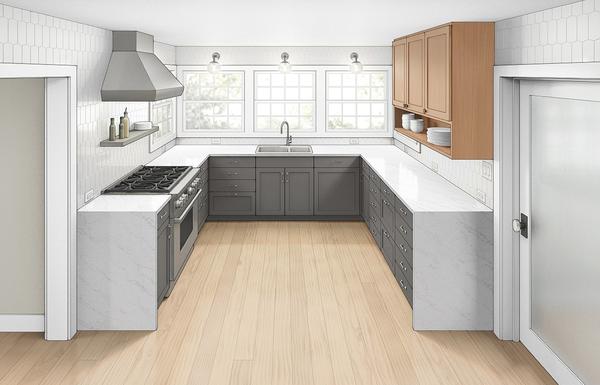
To make use of the existing unusable wall, he moved both of the doors. The one along the dead wall was covered over, while the one between the kitchen and the living room grew 6 in. in width and shifted over 2 ft. to create space for full-depth cabinetry along the dead wall. The shifted opening lines up with a new door on the opposite wall to create a straight-line path from the breezeway to the entertainment area.
The once-unusable wall now has a paneled counter-depth refrigerator and freezer on one end and a pantry on the other to anchor the new zone. Between them, a wine fridge and a cabinet of drawers fill the lower space; open shelves provide storage above the counter.
“I worked the overall layout over a number of times, and having the refrigerator in that primary “U”-shaped part of the kitchen just ate up a ton of counter space,” Kuhlman says. The reclaimed dead zone becomes not only a landing zone for the fridge, but also a station for guests to get themselves a glass of wine or a beer, and it “sets the tone for being able to entertain really gracefully.”
The old “U” was reconfigured to create three efficient zones that allow multiple people to work in the kitchen without getting in each other’s way: one for cooking, one for prep, and one for washing up.
A new gas range with a stainless-steel hood replaces the old electric unit, and new cabinetry provides more thoughtful storage and counter space on both sides. Across from the range, the footprint of the cabinetry grew a bit to create a large prep space, and drawers replaced most of the cupboards for easier access to what’s inside. The sink moved to the center of the back exterior wall, with a new window above and usable counter space on either side. With the sink out of the corner, the dishwasher can now sit aside it without being a tripping hazard.
Kuhlman’s midcentury-modern design choices connect the original kitchen with the aesthetic preferences of its owners. Glossy white tile of elongated hexagons covers the walls from the counters to the ceiling, creating a subtle geometric canvass that brightens the space and contrasts with the darker cabinets. The main base cabinets are painted a dark gray—Benjamin Moore’s Iron Mountain. Natural cherry is used for the uppers and for the cabinetry on the revamped fridge wall to bring warmth to the space. Task lighting provided by globe wall sconces above the windows of the sink wall and other small touches—like the linear chrome drawer pulls—bolster the style’s emphasis on function and simple forms.
The key to a small kitchen, Kuhlman says, is minimizing both physical and visual clutter. The clean lines of the cabinets and tile reinforce that, while removing everything that can be moved from the counters makes the space more comfortable and orderly for cooking. “Having a place for everything is really important, especially in a small footprint,” he says. Part of that equation requires limiting what you bring into the kitchen. “You don’t need every little gadget,” he says. “A knife will do a lot of jobs for you.”
Sources:
Garrett Kuhlman, a project designer at Designs Northwest Architects, is a graduate of Washington State University with a bachelor’s degree in Interior Design. With 22 years of design experience —and an avid cook himself—he has the chops to tailor solutions to his clients’ wishes, and identify what matters most to make a kitchen functional. Here, he was tasked with designing for a couple who loves to cook and has a taste for modern design.
From Fine Homebuilding #295
To view the entire article, please click the View PDF button below.


